LENORE HOWARD
GRAPHIC DESIGNER
+ ARTIST
THE BERN AND THE BEANS COFFEE
COFFEE TRUCK LOGO AND TRUCK WRAP DESIGN: IN PROGRESS
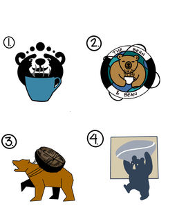
I was contracted by the Bern and the Bean crew because they wanted somebody from the community college I attend to do their logo and coffee truck wrap design. They thought I would have fresh eyes when designing since I was currently in school and being somebody who loves coffee I jumped at the opportunity. At first they wanted as logo that contained coffee and boats and my initial sketches outlined those elements but upon further review they thought the towns love of bears would make it a hit so I brainstormed some ideas that really popped on the side of the truck. After a few revisions we finally come up the muted blue background and the little bear holding the coffee bean and the rest has been history!
DROP IT LIKE ITS KNOT
INDEPENDENT FIBER ARTIST
One of my friends from high school started her own business utilizing mostly instagram and facebook to make sales. After a few sales and successfully gaining a fair number followers she decided it was time for a fresh and unique logo. She didn't really have much of an idea of what she wanted but for someone who doesn't really konw what 'fiber art' is i thought it might be good to make something young and hip that had an actual depiction of what fiber art is in the logo but after much collaboration we decided that her brand is her. Her macrame and yarn pieces are very much a piece of who she is so we came up with the half moon. I love how the business name pop and the circular design looks good in the instagram layout!
1910 PAINT COMPANY
LOCAL SMALL BUSINESS LOGO FOR WORK TRUCK ADVERTISING
A local paint company needed decals to be placed on either side and the tailgate of their work trucks. What better way to advertise than to utilize the vehicles you're driving around town 24/7! After hearing out my client and understanding that it needed to be something that was easily understood since people don't have much time to decipher a logo that's too elaborate when they're in motion we settled on simple shapes and fonts. I think the simplicity is timeless and the fonts make it feel established and professional.


